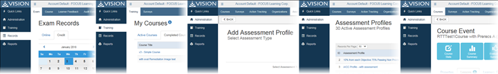
Consistency
The way data and controls are presented to the user is consistent and predictable from page to page, reducing confusion and resulting in an application that is easier to train, learn, use, and support.
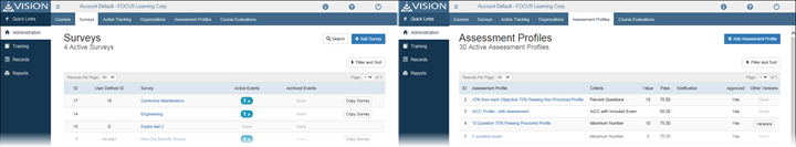
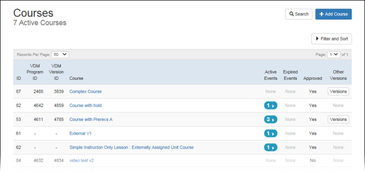
Information Grouping
VISION's web modules present data and options that relate (directly or indirectly) to the specific data being viewed into logical categories, making information and available actions easier to quickly scan and locate.
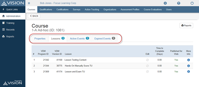
Page Headings
Pages now have consistent and obvious titles and headers, giving the user a clear indication of the purpose of the page and, where appropriate, what specific entity (Course, Course Event, etc.) is being administered.
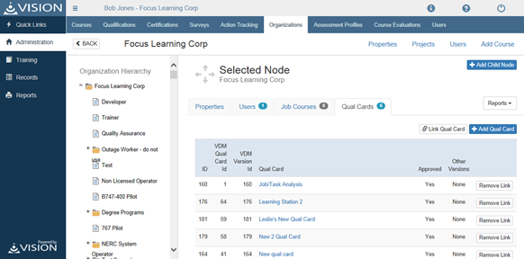
Tables
Tables have a new, consistent style that improves readability and the ability to scan for information. Unstructured tabular data that was previously difficult to read now conforms to a table format.
Responsive Design
We have applied a new presentation framework (Bootstrap) throughout the system to improve how the application appears on different screen sizes, paving the way for use of the application on mobile devices.
Aesthetics/Branding
We have applied a new color palette (including built-in elements of the Bootstrap framework) to reduce eye-fatigue and improve the overall appearance of the application. We have also moved branding styles to a separate stylesheet which allows for quick and easy customization, including the use of customer logos. For customization instructions, open the document "VISIONWeb_Branding_Instructions.docx" located in the installation's root folder.
Visual Hierarchy
We have updated location, size, and color of elements for consistency and to make the most relevant data and actions readily identifiable.
Alignment
Consistent alignment of various page elements allows for improved scanning and readability.